Building a Brand to Fly Higher
Branding Refresh
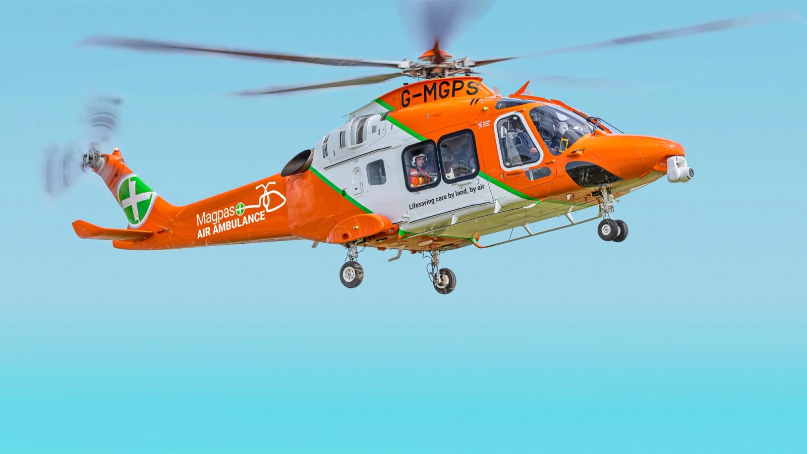
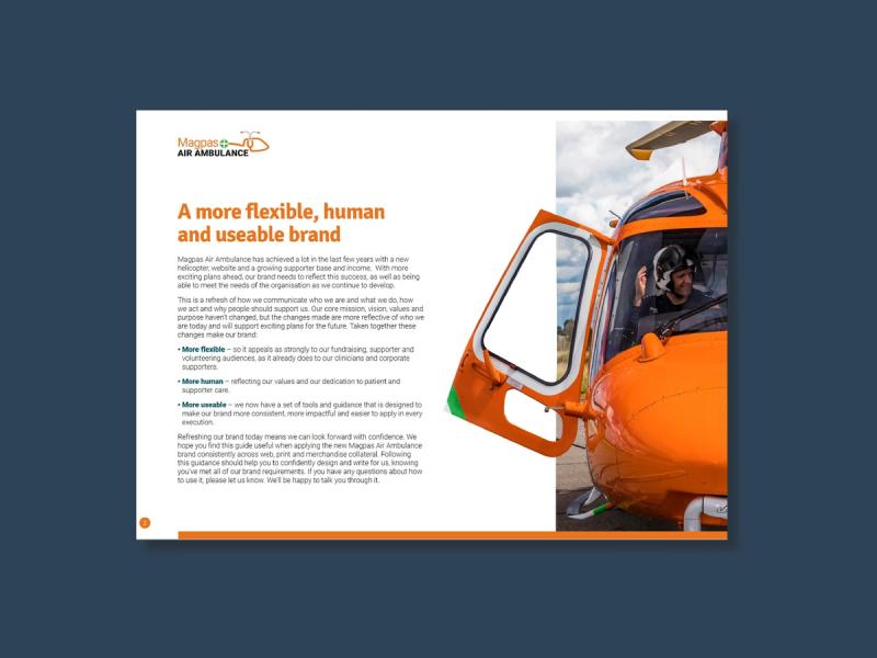
Magpas Air Ambulance asked Cherry Tiger to review and refresh their brand in light of how the organisation had changed over recent years. Having grown their supporter base, delivered a new website and heavily invested in new helicopter technology, as well as having ambitious plans for the future, they needed all elements of the brand to reflect these changes and meet the needs of the organisation going forward.
Specifically, they wanted the new identity to:
- be flexible enough to appeal to supporter, volunteer, clinical and corporate audiences
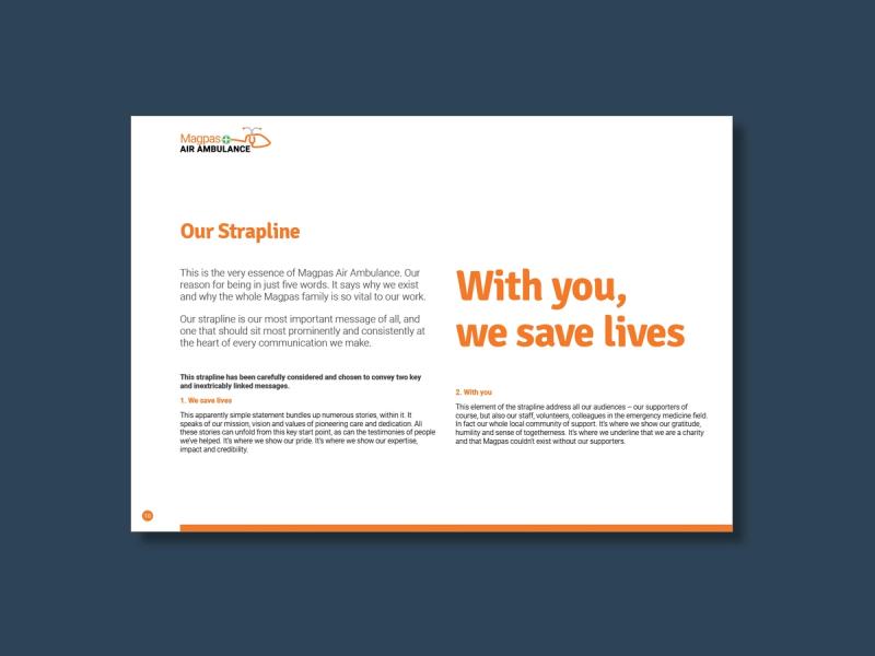
- clearly articulate the brand proposition and key messaging to reflect the organisation as they are now and build a strong case for support
- overcome logo, colour palette, layout, photography and design limitations to make the brand more flexible and usable to all audiences, in all communications and channels
- be pragmatic but deliver a modern, fresh and uniquely Magpas brand identity
- add more humanity and emotion to the brand to be more reflective of Magpas’ core values
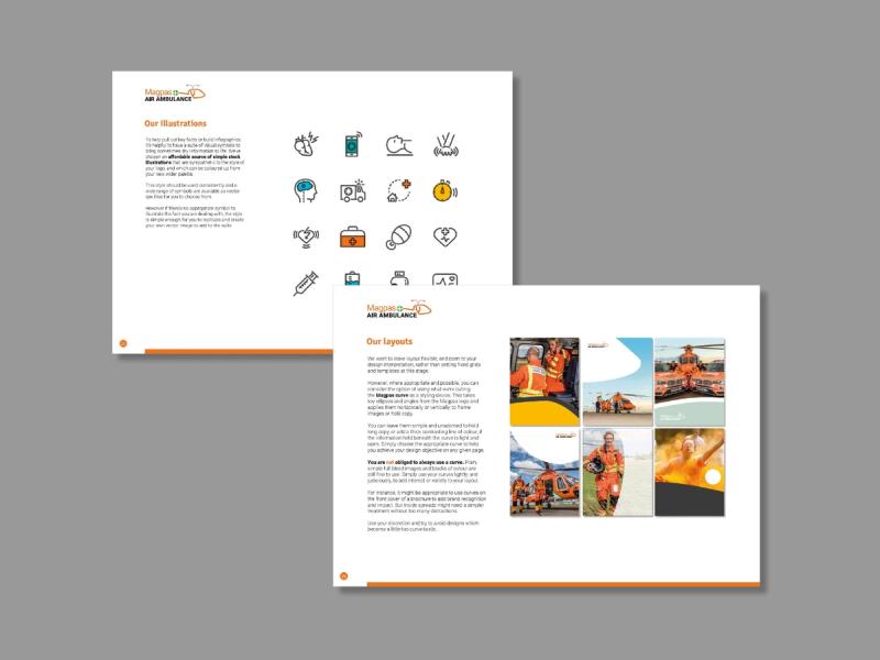
Cherry Tiger conducted in-depth discussions with core stakeholders to drill down into the organisation’s mission, vision and values in order to review how these had changed in practice in recent years.
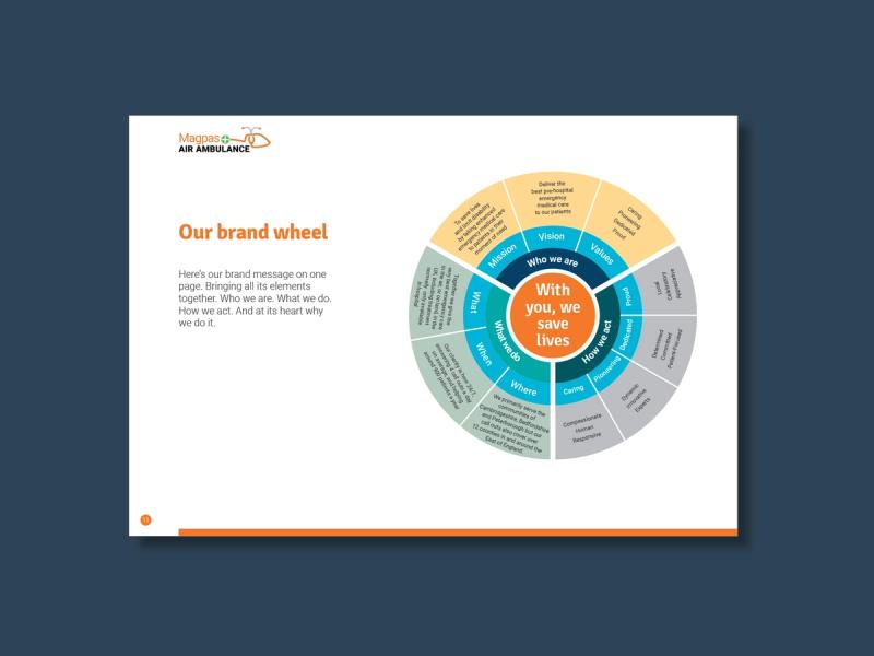
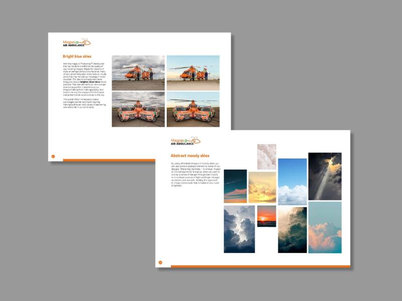
Our starting point was to clearly define and understand Magpas’ story and messaging – setting out who they are, what they do, how they do it and why they do it. We then applied this back to an updated articulation of mission, values and personality. Once we had established the messaging elements of the brand, we were able to develop the visual treatment, from strapline, logo, font and colour palette to photography, layout and illustration.
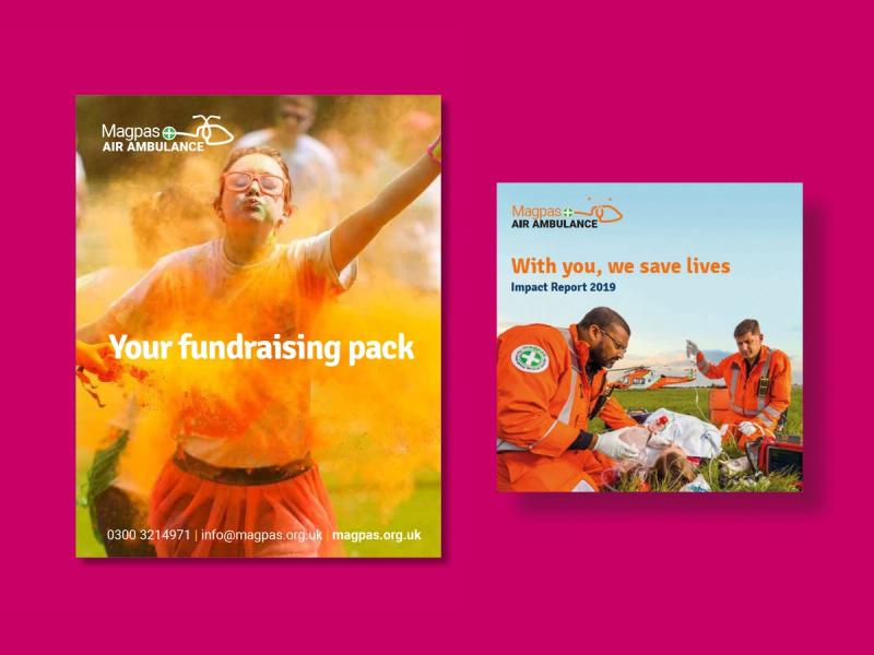
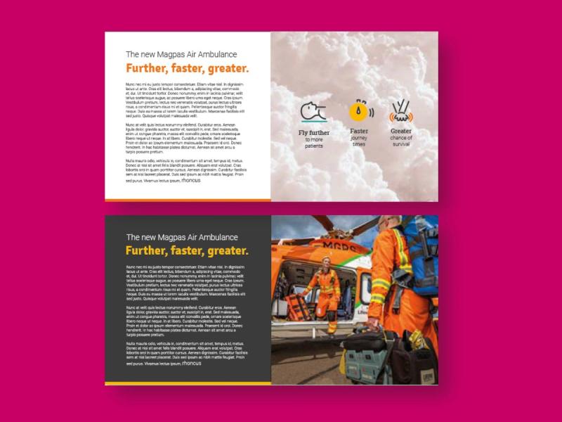
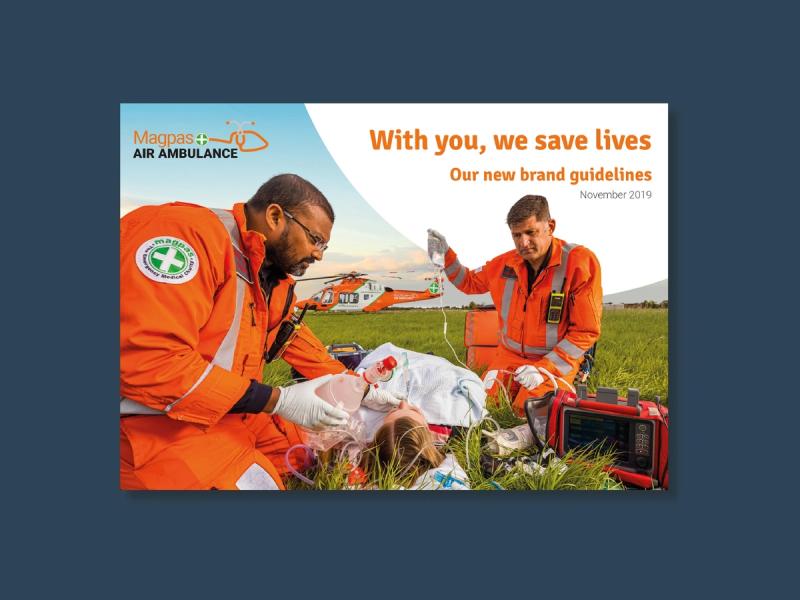
The final iteration of the brand launched with a detailed brand guidelines document. As we’ve continued to work with Magpas they’ve given us really positive feedback and have been delighted with the flexibility and longevity the new brand identity has provided.
More Case Studies

Cherry Tiger
Take a great leap forward
Park House, Park Square West, Leeds LS1 2PW